OVERVIEW
PROJECTS
Six shipped at TikTok Shop
DEEP DIVE
Cash Sharing Campaign
Intern at TikTok
Introduction
Over a three-month internship at TikTok Shop, I delivered 6 projects spanning new feature development and redesign.
I honed my ability to make design decisions driven by quantitative analytics (BOLT), qualitative insights, and user-based hypotheses, contributing to meaningful improvements in growth, education, and shopping experiences.
IMPACT
6 PRDs implemented with measurable gains in creator reach, engagement, and monetization, and a reduction in user complaints
TIMELINE
May 2025 - Aug 2025
DOMAIN
User growth
Education
Online Shopping
Creator
TEAM
UXD (me)
PM
3 Devs
Intern overview
Three months on the creator & affiliation team at TikTok Shop. I shipped 6 projects: defining new features with the PM, redesigning existing ones from data and user reports, and one AI vision project. The team was the best part of it.


Project 1: Cash Sharing Campaign
Context
Campaigns were built around top creators, so L0-L1 creators had little reason to join. Cash Sharing gave them a task-based reward with a low entry bar.
What I did
0-to-1 with the PM: research, scope, end-to-end design, and an A/B test to pick the final direction.

Project 2: Campaign Center Redesign
Context
The campaign page only showed what was running now, so creators could not plan ahead. The redesign surfaces upcoming campaigns early.
What I did
Diagnosed low penetration from campaign supply data and scroll behaviour, then split the fix in two: a UI revamp now, supply forecasting later.
Before

After

Project 3: Featured Upcoming Event Schedule
Context
Creators could not see what was coming next. This page gives upcoming campaigns a consistent, structured format.
What I did
Audited the ops team’s past KV assets, then built a card template and page layout simple enough for them to configure in the CMS themselves.
Configuration rules for operations team



Project 4: Tiered Commision
Context
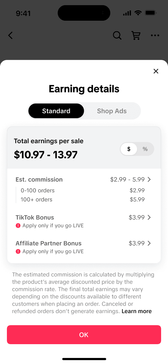
The tiered commission rules were complex enough that creators kept complaining when they claimed. The job was to hide the complexity without hiding what they needed.
What I did
Worked with PM, dev and marketing to agree what each side needed, then cut the interface down to the numbers creators actually act on.
Before

After
Project 5: Tiered Commision
Context
The tiered commission rules were complex enough that creators kept complaining when they claimed. The job was to hide the complexity without hiding what they needed.
What I did
Worked with PM, dev and marketing to agree what each side needed, then cut the interface down to the numbers creators actually act on.
Before

After

Before

After

Project 6: Education Hub
Context
Creator Academy engagement was very low. The directory was confusing, mobile felt off-brand, and none of the formats creators wanted were supported: video, interactive, UGC.
What I did
Ran research on what creators needed to learn and what it would cost to produce, then set the content scope and built the navigation structure.


Deep dive — Project 1: Cash Sharing Campaign
Getting low-tier creators past their first three videos
0-to-1 with one PM and three engineers. Research and scoping, an incentive the business could afford, and an A/B test to settle the final direction.
PROBLEM & RESEARCH
Where the growth was leaking
Low-tier creators are the largest segment on TikTok Shop, and the one getting the least early-stage support.

Who counts as low-tier

Where they drop off
Most never clear the early stage. To find out why rather than guess, I went through TikTok’s existing creator research with the PM. Three reasons came out of it.


GOALS & SCOPE
How might we…
Provide low-tier creators with early-stage motivation and attainable rewards, so they stay engaged long enough to build momentum and grow?
What each side needed
Two lists to satisfy at once. The creator side came from the research. The business side I confirmed with the PM: no direct revenue, so the cash pool has to stay controllable and engineering and ops effort low.

Cutting education down to what mattered
Engineering raised it first, and I agreed. But cutting education out entirely would break the motivation loop, so I offered a trade.

The scope we committed to

CONCEPT
Eleven directions, one shared scorecard
I built the scoring framework with the PM: eleven mechanics from the market, each rated 1-5 on user needs and business constraints. Cash sharing came top on both.

Two pools instead of one
A basic pool with a low entry bar to get people in, and an extra pool that scales with how much high-quality video they post.

REACH & JOIN
The stage I was redesigning
Sign up, post, consistently post higher-quality videos, level up. Low-tier creators stall on the third step, so that is the one the campaign rebuilds.

Reached → interested → join. Then a two-stage loop: get educated, post, unlock, and again for Stage 2.
STAGE 1 · REACHED & INTERESTED
Where creators meet it
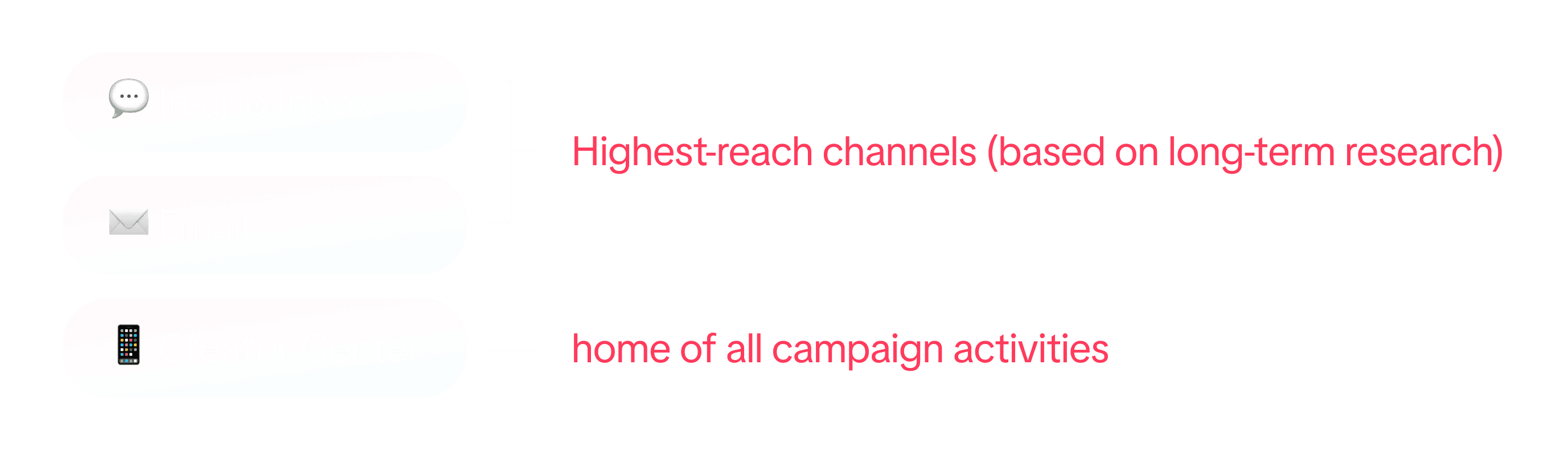
In-app inbox and email are the two highest-reach surfaces in the growth team’s long-term research. The Creator Center is where every campaign already lives.
An entry card that fits in, and stands out
The card matches the format of every other Creator Center campaign, then uses its own illustration so nobody mistakes it for one of them.


Illustrations get them to look. They don’t get them to join.
CALLBACK · PAIN POINT 1
Leaderboard is the default campaign format on TikTok Shop, and its rewards are dominated by top creators. The entry barrier is too high for low-tier creators.
Enough of those campaigns and a mental model forms — and it is the thing standing between a creator and this campaign.
DEFAULT MENTAL MODEL
“Campaigns are too hard to win.”
So they don’t participate. The entry card gets one screen to prove otherwise.

Which means the card has to land exactly two things in very little space.
MUST LAND 1
This campaign is designed for them
Low barrier — say the requirement out loud.
MUST LAND 2
It offers real, attainable rewards
Cash — show the actual pool amount.
I explored two ways of saying it, and put both in front of creators.
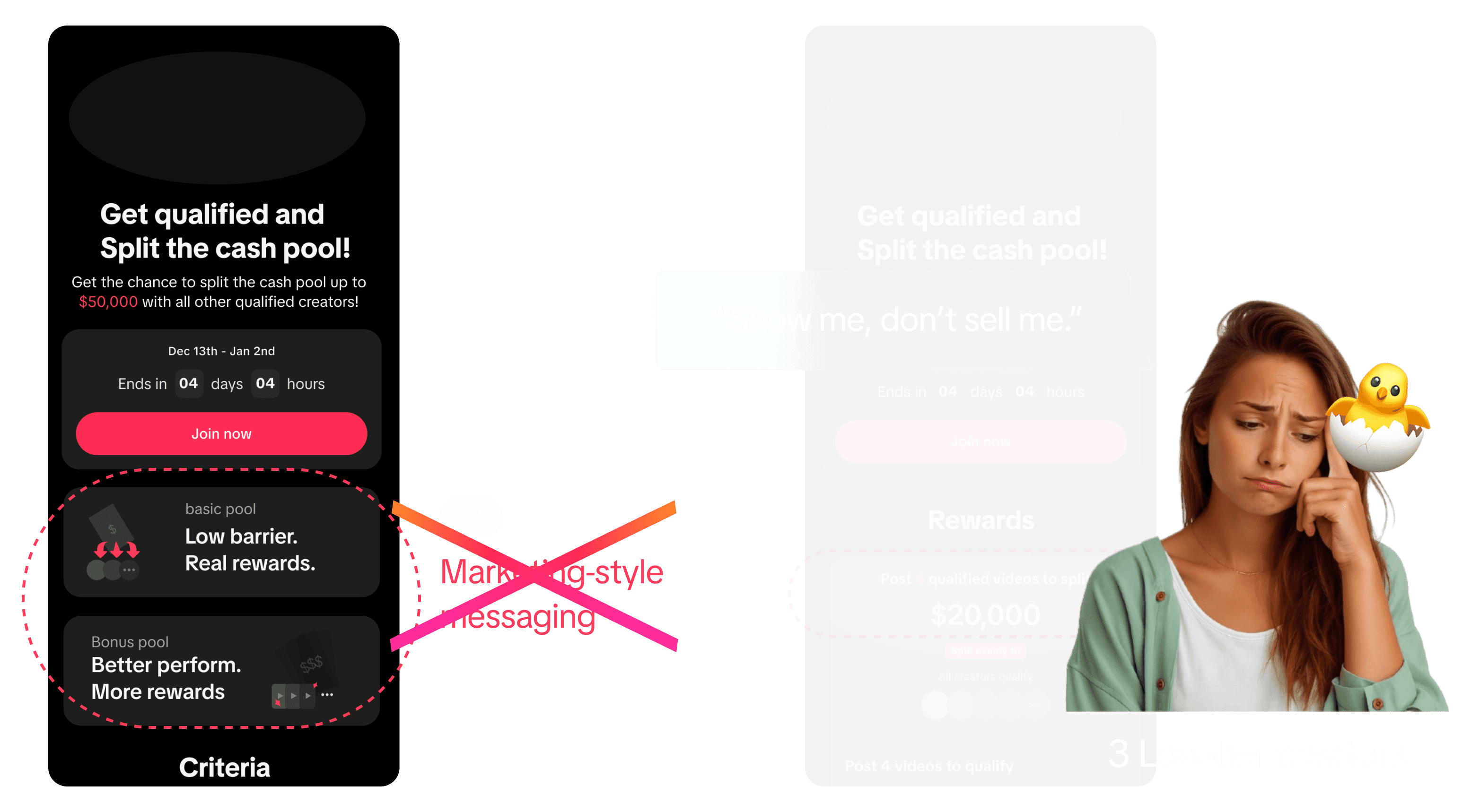
Version 1 sold the campaign; version 2 stated it. Three low-tier creators picked version 2 — “show me, don’t sell me.”

So the card leads with the requirement — three qualified videos — and the size of the pool
72.2%
of reached creators joined the campaign
Participation rate — share of reached users
EDUCATE & POST
STAGE 2 · GET EDUCATED
Teaching only what unblocks a post
CALLBACK · PAIN POINT 3
Low-tier creators don’t know how to learn, or what to focus on. The learning curve is steepest exactly when motivation is lowest.
I had already told the PM and engineers I would keep this cheap: surface only the most critical education, rather than build a tutorial system. So instead of writing new material, I went back to the growth team’s existing research on what actually blocks a high-quality post.

The top three barriers, ranked — and the three things the campaign teaches, in that order
The ranking comes from past interviews with inactive and low-tier creators, the research team’s work on motivation and churn drivers, and internal TikTok Shop research on creator growth patterns.
11.2%
more high-quality videos from participating low-tier creators
Post-launch, against non-participants
STAGE 3 · POST VIDEOS
Keeping people posting once they start
CALLBACK · PAIN POINT 2
Early videos rarely generate revenue. Effort feels unrewarded and easy to abandon, so creators lose motivation and drop off.
So the campaign has to give timely status and positive feedback while it runs. I built two versions of the progress display.
Two hypotheses, and they pointed opposite ways
ASSUMPTION
Version 2 wins on clarity
Spelling out the requirement — four eligible videos — helps creators understand how to qualify, so more of them successfully enter Stage 1.
COUNTER-HYPOTHESIS
Version 2 caps effort
Making the requirement that explicit gives people a place to stop. They post four and stop, so total videos per creator fall below version 1.
I ran an A/B test to settle it. The counter-hypothesis won, so version 1 shipped.

UNLOCK & GET PAID
STAGE 4 · UNLOCK & LEVEL UP
Moving people from Stage 1 into Stage 2
CALLBACK · PAIN POINT 3
Making a high-quality video is hard. The learning curve is steep at the beginning, and this is where motivation bottoms out.
The Extra Reward Pool answers it with one rule: high-quality videos earn, and more high-quality videos earn more.
DESIGN CHALLENGE
Design a clear and intuitive transition from Stage 1 to Stage 2 that helps users understand the shift in focus, and motivates them to go after the Extra Reward Pool.
My first concept used two parallel lines, one per stage, to make the split obvious. I took it to the developers for a feasibility check and they said it needed new layout logic and dynamic rendering, which was a lot of overhead.
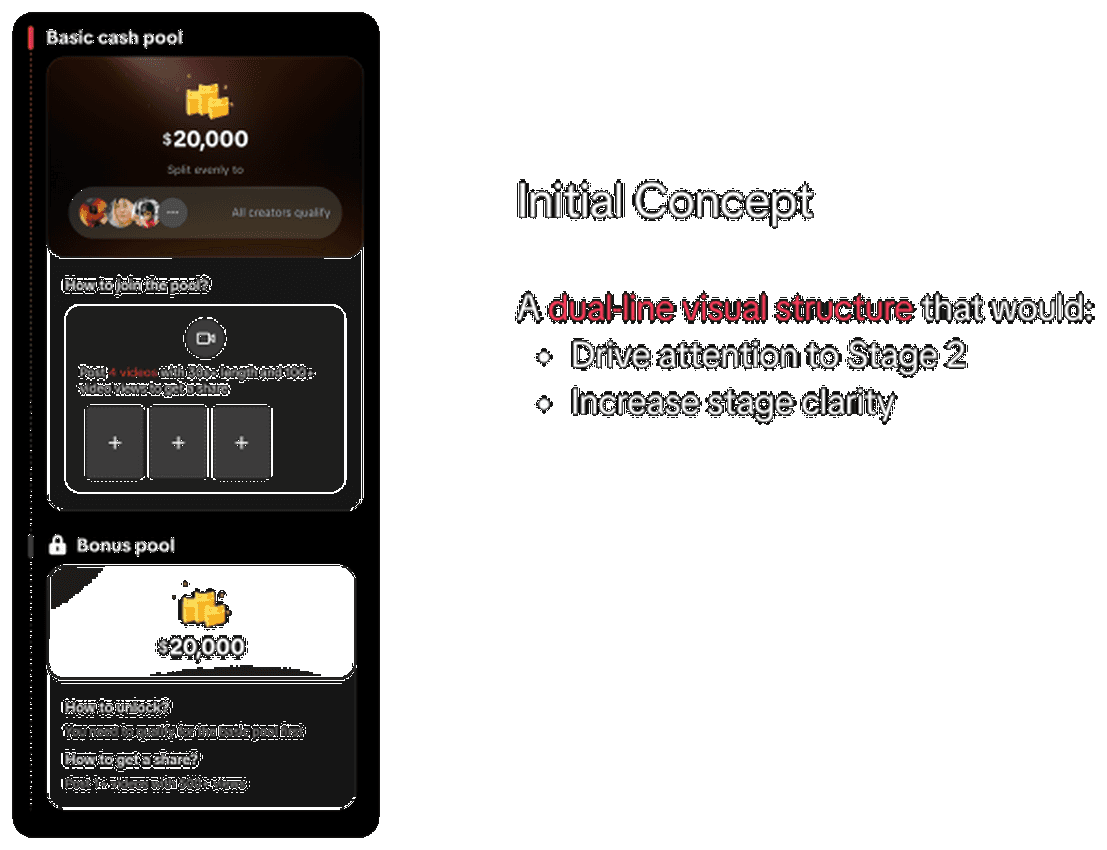
Initial concept — two parallel lines, one per stage
Engineering priced it, so I had to weigh it
THE COST
Dev complexity
THE QUESTION
Would this structure meaningfully improve Stage-2 engagement?
Worth paying for only if the answer is yes.
No A/B test was available for an unbuilt design, so I validated it against comparable leaderboard campaign flows already running on the platform.
WHAT THE DATA SHOWED
Screen 2 and screen 3 reach rates were nearly identical
People who make it past screen 1 keep scrolling on their own.

SO
If users are motivated enough to proceed, they will scroll without the extra structure
The dual line would not be doing the work I designed it to do.
Cost outweighed effectiveness, so I removed it.

The verdict: the complex design would not significantly shift behaviour

Shipped instead — one line, with the inactive stage folded away. Same progression signal, no engineering overhead.
53%
of Stage 1 winners also earned a Stage 2 reward
Post-launch
GETTING PAID
The stage creators care about most
Money is where trust is won or lost, so three rules governed the reward page.
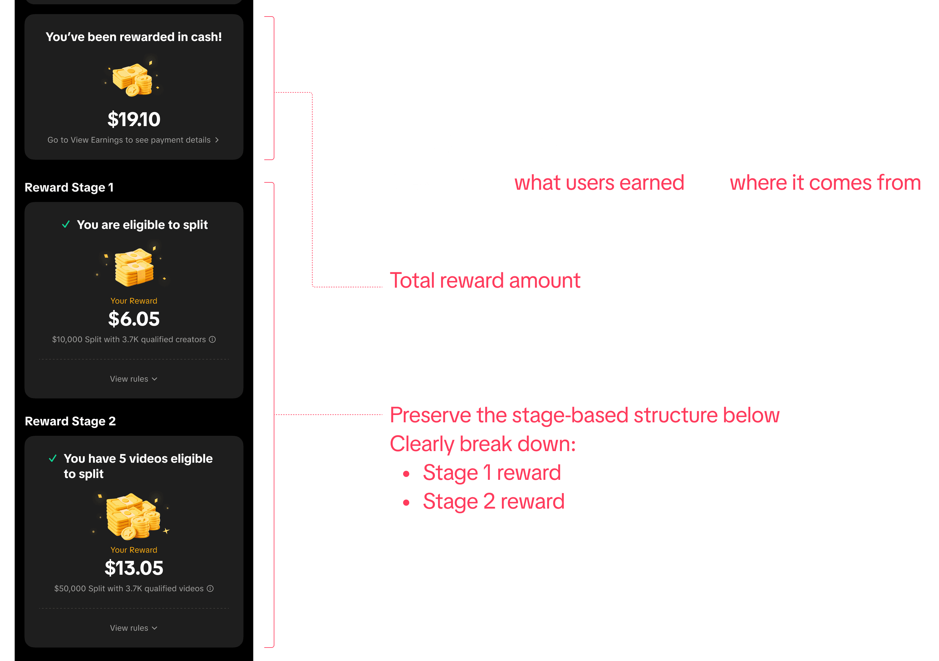
01 — break the money down: total on top, then Stage 1 and Stage 2 listed separately, in the structure they already know

02 — say where the money goes: a clear entry point into earning and payment details, available whenever they want it

03 — show the processing state, which sets expectations and takes load off customer support
REFLECTION
Most of the work was in the states
Beyond the happy path, the real load was every state and edge case across the entry points and the detail pages — and missing one of them is how a cash campaign goes wrong.

If time and resources were not the constraint
Three things I would take further: fold campaigns into a real growth path, use AI to guide creators end to end, and push personalised tasks to them instead of making them go looking.
