

From Lookup to Locked In
Introduction
Planning your semester shouldn't mean juggling three different tabs. This feature integrates course details directly into GT Scheduler—so students can see everything they need, right where they're already planning.
As the sole PM and designer, I led the full process: scoping the feature under tight deadlines, designing for real user workflows, and balancing information completeness with a low cognitive load.
TIMELINE
Aug 2025 (4 months)
TEAM
1 UXD & PM (me)
1 EM
6 Devs
TOOL
Figma
Google AI Lab
kEYWORD
Efficiency Tool
AI
CONTEXT
Product overview
GT Scheduler is the largest course planning platform at Georgia Tech, serving 40K+ active users.

Problem Space
While the scheduling experience itself works well, user growth has plateaued and satisfaction has declined because students describe the course selection decision-making process as extremely painful.
My Role
1EM, 1PM & UX(me), 6 developers
As the sole designer, I worked under significant constraints (non-profit environment, no full-time dedicated development resources) to identify the highest-impact opportunity to improve retention and user satisfaction.
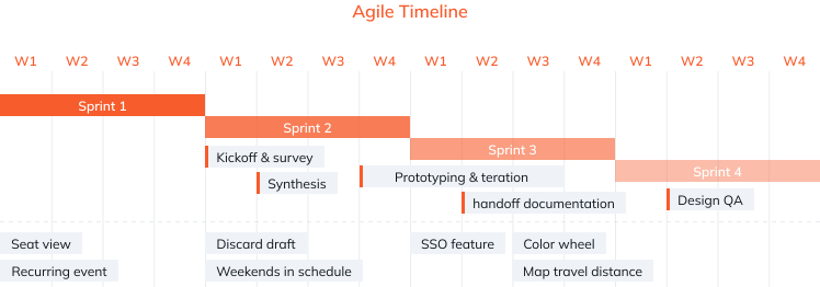
Agile working style
Because the team is relatively small, to quickly arrive at the most suitable and optimal design, I adopted an agile working style. Whether it's surveys or designs, I quickly complete them and present them to users and other team members for feedback. Additionally, besides this major feature, I have seven other features that I need to design and handle.
Impact
+9%
Active Users
62%
Feature Adoption
85%
User Satisfaction
FINAL DESIGN
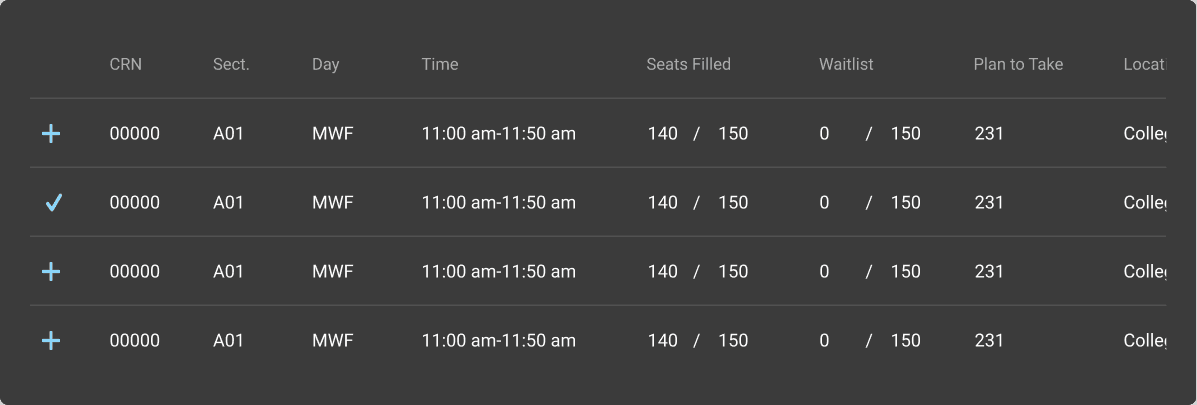
Compare and review course information for selected classes
Compare and review course information for added classes
Users rate the courses they are taking and input the number of work hours for each.
USER RESEARCH
To understand the issues users are facing with the GT scheduler, I collaborated with the PM to conduct user research. After identifying trends through a survey, we selected five users with trending issues for in-depth interviews to gain deeper insights into the problems.
400+
Questionnaires
10
Interviews
Main pain points
76%
of users report that the "course selection decision" is extremely painful, needing to switch frequently between 4-5 platforms like RMP, Course Critique, and Oscar.
"I hope the course selection process can be integrated with the scheduling process (gt scheduler), as the timing decisions and other information decisions should be part of a complete course selection process."
Meet the students behind GT Scheduler
The Optimization-Seeker
Age:
20
Education:
Georgia Tech, Sophomore, CS Major
Goal
Complete remaining core requirements
Take required CS courses
Add one interest-based elective
Pain Points
Feels overwhelmed by multiple core options
Struggles to compare trade-offs between course combinations
Fears making the “wrong” academic decision
Decision-Making Tendency
Decisive
Highly Indecisive
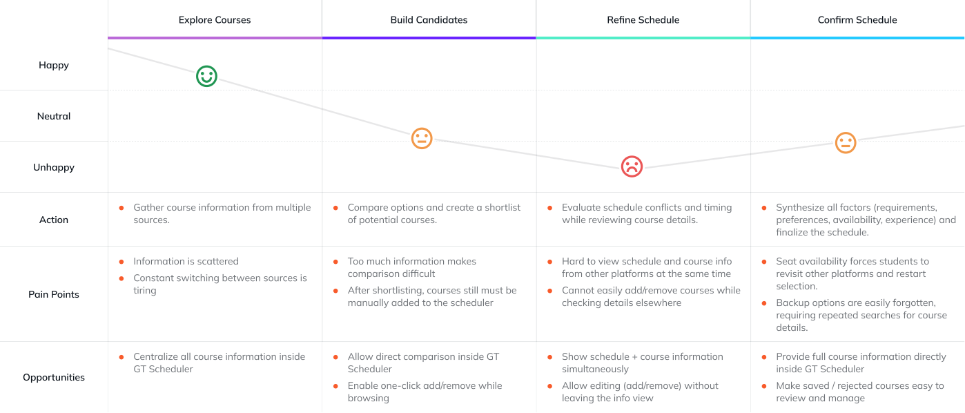
The journey of picking the ‘right’ courses
Design challenge 1
How might we enhance the scheduling workflow with richer information access without disrupting students’ established habits?
Problem sentence
Students need to evaluate both course information and schedule timing at the same time when creating their schedule.

Current Workflow to schedule the classes
Richer Information Access
❌ Concurrent Course-Schedule Decision-Making
Test between different structures
I iterated on two structural directions to determine whether course information should live within the scheduler or exist as a parallel tab. Each option was tested to understand its impact on visibility, continuity, and adoption.
01
Create Low-Fidelity Prototypes for Both Structural Approaches

Structure 1
A separate Course Search tab that fully decouples search from scheduling.

Structure 2
A Course Detail view embedded within the Scheduler for in-context access.
02
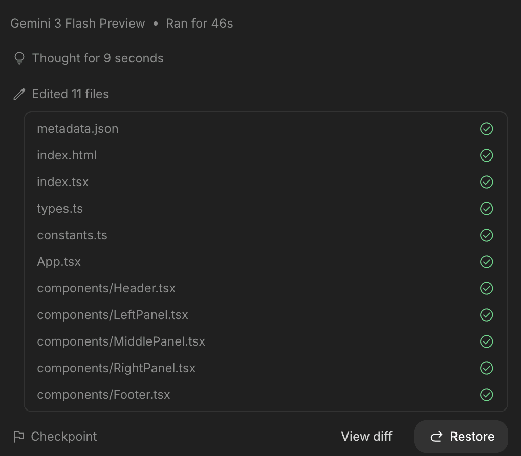
Build Interactive Prototypes Through AI-Assisted Coding


03
Conduct User Testing Using the Interactive Prototypes
Structure 1
Separate Course Search tab
Structure 2
Course Detail view embedded
Final design decision
After comparing both structures, I chose the integrated approach. It preserved the existing user flow while making course information highly visible without being disruptive.
Structure 1
The penetration rate of the tab is particularly low, making it hard for users to notice.
It has been separated from the existing flow, and users have reported that it is difficult to adapt.
Structure 2
The flow is completely integrated with the original flow
Very noticeable but not disturbing
Design challenge 2
How might we surface the most decision-critical course information so students can make confident choices with minimal cognitive load?
Problem sentence
Current information platforms, such as Oscar, Rate My Professor, and Course Critique, have disorganized and scattered information, making it difficult for users to focus and compare, leading to overwhelming experiences.


❌ Completeness & Low cognitive load not balanced
User research
To research which information students consider most important when selecting courses, and to balance the completeness of information with cognitive load in the new features, I distributed a survey.


Data analysis
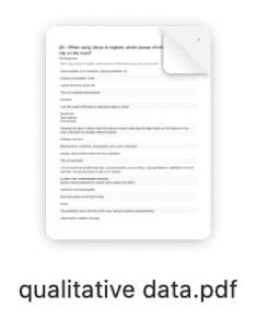
I exported all quantitative data in a format suitable for analysis and all qualitative data as reports in Qualtrics.
01
Create Reports for quantitative data


02
Thematic analysis for qualitative data

Result
Through analysis of the data obtained from the survey, I have derived the course information that needs to be presented in the product and their priorities.
Must have
Must have
Rating
Average GPA
Difficulty
Time / Schedule
Prerequisites
Description
Location
Could Have
Breakdown
Assessment
Distribution
Review
Should Have
Syllabus
Example projects
Design challenge 3
HMW design a scalable way to collect and maintain course information within the platform aitself?
Problem sentence
Relying on third-party APIs introduces uncontrollable stability risks due to unpredictable version changes, downtime, and rate limiting constraints; therefore, we decided to build and maintain our own platform database to ensure system reliability and long-term scalability.
Third Party API
Third-party vendor lock-in
Rigid, uncontrollable data schema
Costs spiral at scale
Third-party privacy exposure
Third Party API

Performance tuned to your needs
Favorable unit economics at scale
In-house data security
Proprietary data moat
In-product data input entry points
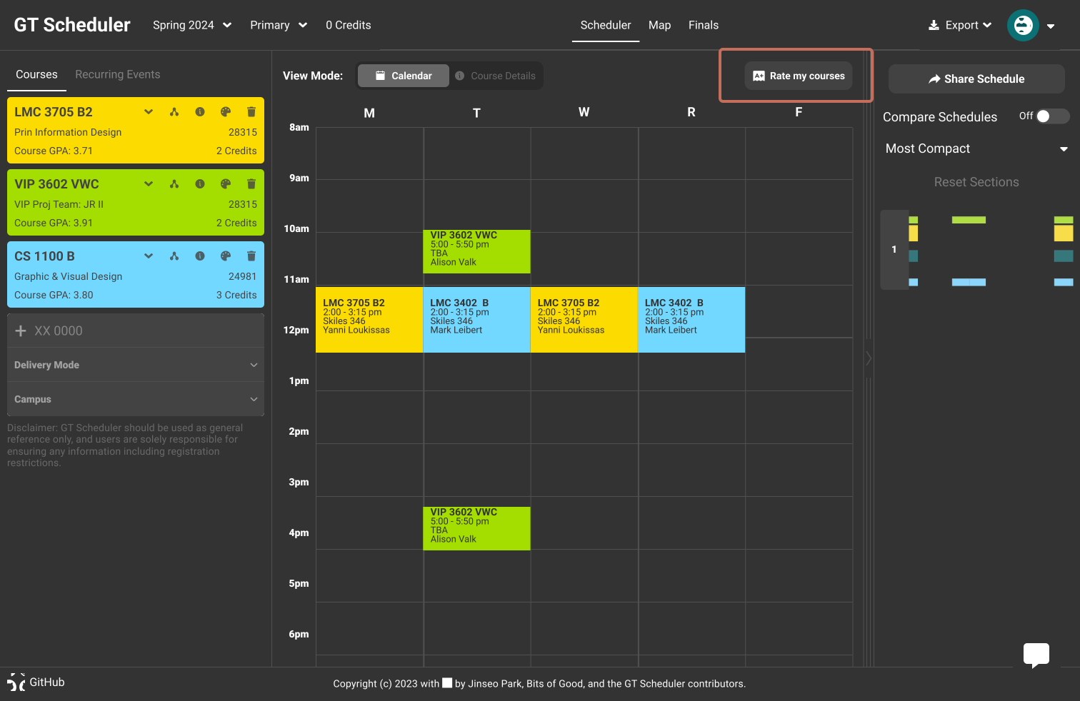
To build our own database, we need to ensure that we collect enough data from users. Therefore, I have designed two entry points for data input to guarantee the quantity of data we obtain.
Top notification
Temporary

TIMING
Aligned with peak usage window
RATIONALE
01 High reach rate
41.28%
Top notification is the highest-performing surface for reaching users.
Concentrated usage window
78.12%
Most scheduler activity clusters in the 2 weeks before registration closes.
Time-sensitive format
78.12%
High-interruption prompts must be brief and shown at the right moment.
Persistent Button
Permanent
TIMING
Always visible within the user's path
RATIONALE
Always-on access
41.28%
Users need a fixed, low-interruption entry point they can return to at any time.
In-path placement
78.12%
Positioned within the feature flow to maximise discoverability and completion rate.
Ensure Completion
Reaching users is the first step — getting them to complete is the goal. The form must be as frictionless as possible to maximise completion rate.
Here is the data to be collected for each course the user takes:
Overall Rating
Level of Difficulty
Workload per Week
Design point 1
Auto-fill from Schedule


The system auto-detects courses from the user's existing schedule. Users confirm, modify, or add courses manually — no need to start from scratch.
Design point 2
One Course Per Page
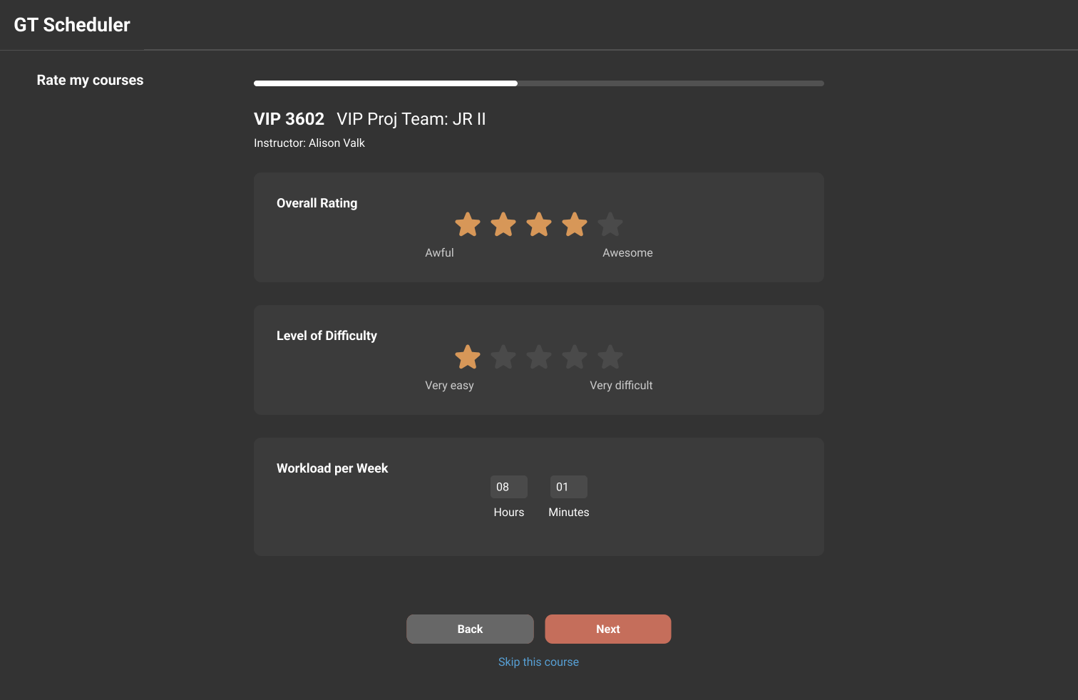
Each page focuses on a single course — reducing cognitive load and keeping users focused on one input at a time.
REFLECTION
01 Balancing Design Quality and Development Capacity
Wearing both the PM and designer hat was a real challenge — I constantly had to ask myself whether my designs were actually buildable within our dev capacity, not just beautiful on paper. Learning to manage my time across design and dev tickets was a big growth moment for me.
02 Scoping Features Based on Priority and Time Constraints
Honestly, we wanted to build everything — but we just couldn't. One of the biggest lessons I took away was how important it is to nail down scope early, based on what actually matters right now. That discipline of choosing what not to build was harder than it sounds, but it made all the difference.
03 Leveraging AI as a Productivity Multiplier
AI genuinely felt like having an extra teammate on this project. Being able to spin up prototypes quickly meant I could get real feedback faster and iterate in ways I wouldn't have had time for otherwise. It really changed how I think about my workflow going forward.